Dissecting Android's Updated Visual Identity

Table of Contents
Material You: The Foundation of Android's New Look
Material You, the evolution of Material Design, forms the bedrock of Android's refreshed appearance. It's not just a visual update; it's a philosophy shift towards personalized and adaptive interfaces.
Evolution of Material Design:
Material Design, introduced years ago, established a consistent design language for Android apps. Material You builds upon this foundation, adding significant layers of personalization and dynamic behavior.
- Dynamic theming: Users can now set a wallpaper, and the system intelligently extracts colors to create a unique, personalized theme across the entire OS. This includes accent colors, system UI elements, and even some app interfaces.
- Personalized color palettes: The system dynamically generates color palettes based on the user's chosen wallpaper, creating a truly unique and tailored experience. This goes beyond simple accent colors; it subtly adapts throughout the UI.
- Adaptive components: Material You components adapt their appearance and behavior based on the context and user settings, providing a more intuitive and cohesive experience. This includes adaptive shapes, sizes, and animations.
Material You enhances personalization and user experience by making the Android interface feel uniquely tailored to each individual user, fostering a sense of ownership and engagement. Imagine a system that seamlessly adapts to your daily changing wallpaper preferences!
Impact on App Development:
For developers, adapting to Material You presents both opportunities and challenges. Embracing Material You allows developers to:
- Enhance user experience: Apps that adopt Material You seamlessly integrate with the system's dynamic themes, creating a cohesive and personalized user experience.
- Improve brand consistency: Following Material You guidelines helps ensure that apps look and feel consistent with the overall Android ecosystem, leading to a more professional and polished image.
However, there are challenges:
- Adoption curve: Adopting Material You requires developers to update their apps, which can take time and resources.
- Design updates: Google continually refines Material You, necessitating ongoing updates to keep apps current and consistent.
Fortunately, Google provides ample resources, including detailed documentation, design guidelines, and code samples, to assist developers in the transition.
Refined Iconography and Branding
The updated Android visual identity features a significant refresh of its iconography and overall branding. This extends beyond simple aesthetic changes, aiming for a stronger, more unified brand presentation.
Changes in Icon Design:
Android's icons have undergone a subtle yet impactful transformation. The changes are subtle, aiming for a more modern and consistent appearance:
- Shape and Style: Icons now feature more consistent shapes and styles, moving towards a more unified look and feel across the system.
- Color Consistency: Colors are more harmonized and aligned with the overall system's dynamic color scheme, creating a visually pleasing and cohesive experience.
For example, the Settings icon has been refined to maintain its essence but with cleaner lines, improved readability, and harmonized color palette. Before and after images clearly show the improved consistency. (Insert before-and-after images here).
Brand Consistency Across Platforms:
The updated visual identity aligns seamlessly with other Google products and services, strengthening Google's overall brand identity.
- Visual Synergies: The design language used in Android mirrors elements found in other Google apps, such as Google Drive and Gmail, creating a familiar and consistent experience across platforms.
- Strengthened Brand Identity: This unified visual language reinforces Google's brand and strengthens user recognition and recall across its vast range of services.
Color Palettes and Accessibility
Android's updated visual identity places strong emphasis on dynamic color schemes and accessibility features.
Dynamic Color Schemes:
The use of dynamic color schemes, generated from user-selected wallpapers, provides a high level of personalization.
- Technical Aspects: The system intelligently analyzes the wallpaper to extract dominant colors and then generates a harmonious palette, ensuring consistent application throughout the system interface.
- Impact on Personalization: This adaptive approach enhances personalization by creating a uniquely tailored look and feel for each user. It moves beyond simple accent colors to a deeply personalized aesthetic.
Accessibility Considerations:
The new design actively prioritizes accessibility:
- Improved Contrast: Color combinations are chosen to ensure sufficient contrast, enhancing readability for users with visual impairments.
- Larger Fonts: The system offers larger font sizes and improved readability settings, catering to various needs.
- WCAG Compliance: The new design adheres to Web Content Accessibility Guidelines (WCAG), ensuring accessibility for a broad range of users.
These choices ensure inclusivity, making Android a more user-friendly platform for everyone.
Conclusion
Android's updated visual identity represents a significant evolution, characterized by the introduction of Material You, refined iconography, and thoughtfully designed color palettes that prioritize accessibility. The changes enhance user personalization, offering a more intuitive and engaging experience. For developers, adapting to Material You presents both challenges and significant opportunities to create better apps.
Explore the new Android design, update your apps to the Material You guidelines, and stay informed about future updates to Android's updated visual identity. Visit [link to Android Developer documentation] and [link to Google's Material Design guidelines] for further information and resources.
Featured Posts
-
 Pre Game Focus Butler Shrugs Off Miami Pressure
May 16, 2025
Pre Game Focus Butler Shrugs Off Miami Pressure
May 16, 2025 -
 Gambling On Catastrophe The La Wildfires And The Ethics Of Disaster Betting
May 16, 2025
Gambling On Catastrophe The La Wildfires And The Ethics Of Disaster Betting
May 16, 2025 -
 Details Emerge House Republicans Outline Trumps Tax Policy
May 16, 2025
Details Emerge House Republicans Outline Trumps Tax Policy
May 16, 2025 -
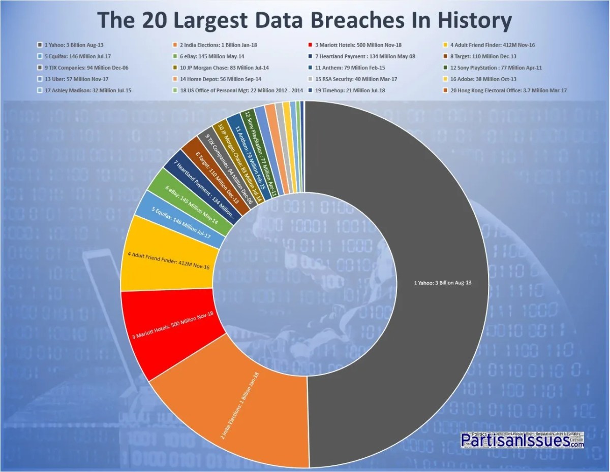 T Mobile Penalty 16 Million For Years Of Data Breaches
May 16, 2025
T Mobile Penalty 16 Million For Years Of Data Breaches
May 16, 2025 -
 Understanding Creatine Is It Right For You
May 16, 2025
Understanding Creatine Is It Right For You
May 16, 2025
Latest Posts
-
 Cubs At Padres Spring Training Game Preview Mesa March 4th 2 05 Ct
May 16, 2025
Cubs At Padres Spring Training Game Preview Mesa March 4th 2 05 Ct
May 16, 2025 -
 March 4th Spring Training Baseball Cubs Vs Padres In Mesa Game Preview
May 16, 2025
March 4th Spring Training Baseball Cubs Vs Padres In Mesa Game Preview
May 16, 2025 -
 Cubs Vs Padres Mesa Spring Training Game Preview March 4th
May 16, 2025
Cubs Vs Padres Mesa Spring Training Game Preview March 4th
May 16, 2025 -
 San Diego Padres News Jackson Merrill Returns Luis Campusano Optioned
May 16, 2025
San Diego Padres News Jackson Merrill Returns Luis Campusano Optioned
May 16, 2025 -
 Padres Lineup Update Merrills Return Campusanos Demotion
May 16, 2025
Padres Lineup Update Merrills Return Campusanos Demotion
May 16, 2025

